by Alex Brown | Feb 7, 2018
An inside look into the process behind gig poster design
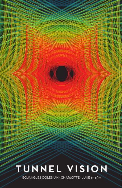
Gig Posters are pretty cool to design because they are unique to each city. Bands, Musicians and Artists would contract out to local artists/designers to design a special gig poster just for the one night they were in town. These gig posters would then be blanketed around town. The thing that makes a Gig Poster unique is that it has to convey a symbolic meaning while representing the style of music for the artist.
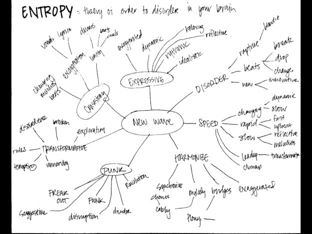
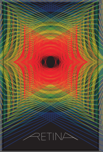
When I first started this project, I wanted to create a gig poster for a punk/new wave band since that happens to be one of my favorite styles of music. However, as the project commenced, I started to alter that. My first iteration was quite simple in its nature and is reminscent of a club/dance/edm style of gig, something like Deadmau5 or even The Weeknd.
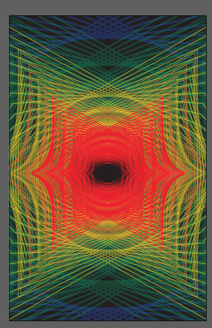
Things began to transform as I continued to continue to be bored in Illustrator. I knew I wanted to incorporate the blend tool since it’s so awesome, so I just started playing around with that. I ended up creating two triangles and blended them together, eventually continuing to layer them together. The result was this cool mouth-like effect.
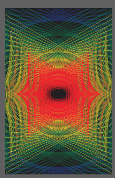
I felt that I was headed in a right direction, but it needed something more. I then rotated the center triangle and this created an eye! I love it. The first word that initially came to my mind was retina, and I started to play around with this, but I wasn’t feeling it.
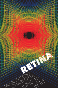
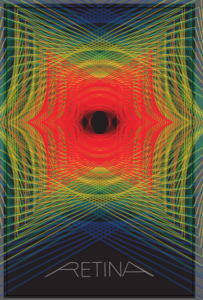
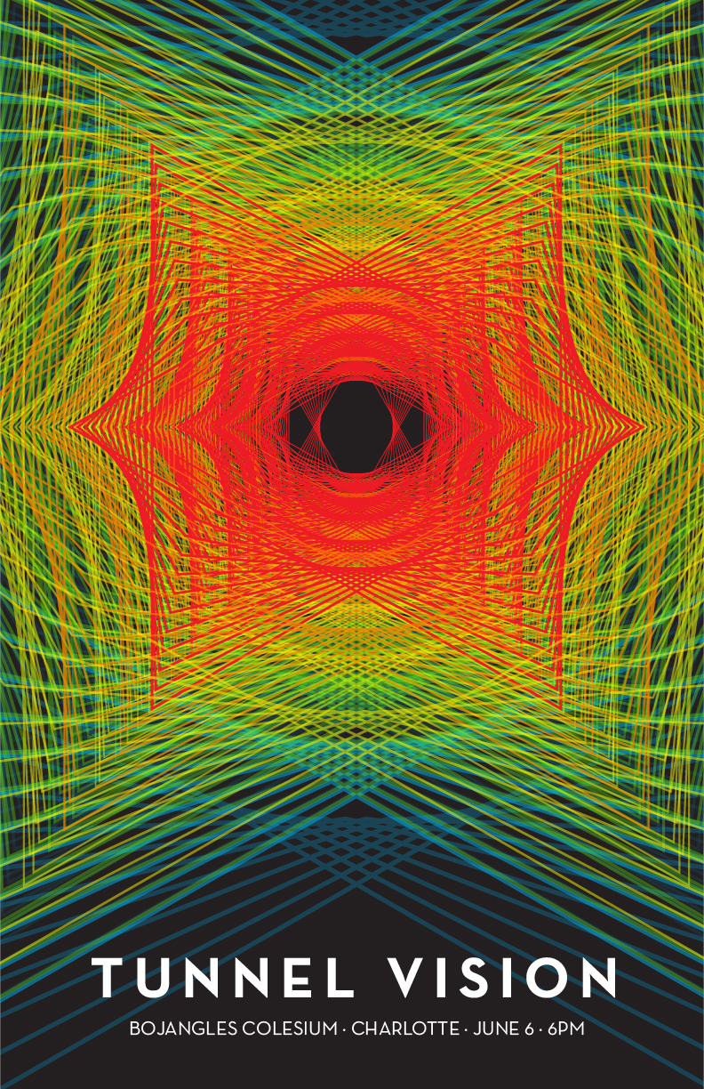
Then, randomly, as I was talking my mind out loud, just bouncing words and ideas out of my head, the name came to me… Tunnel Vision! I felt that this name fit the style of the poster – which is alternative. The thing I love about this is the progression of values towards the center. It suddenly gets more vibrant and more in your face.
If you want to take a look at more gig posters, check out these 80 amazing examples of Gig Poster Designs
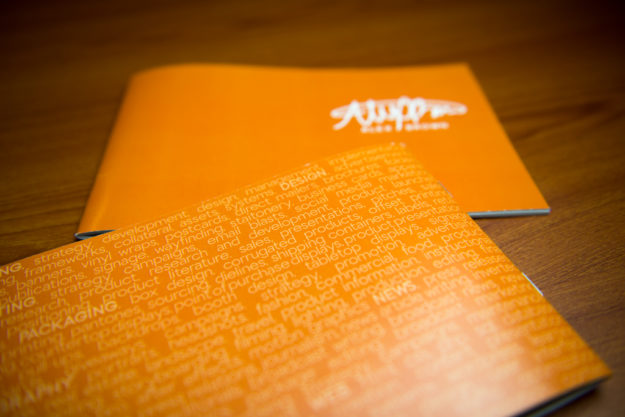
by Alex Brown | Mar 30, 2017
How spreading out my creative versatility and skillset in a booklet turned my resume into a creative resume. How it all comes together.
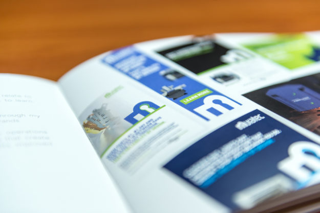
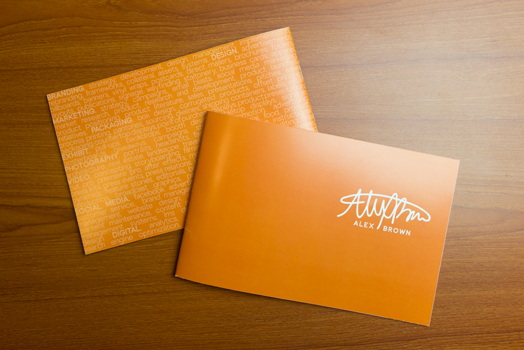
I wanted my creative resume to be different enough, yet still be mainstream. I love booklets. I think they scream professional and they are so fun to work with especially because of the spread design.
My original creative resume plan wasn’t able to come to production because of unforeseen changes in what has been going on lately. The very essence of my original creative resume plan was a booklet that tied into something that you can eat. It was witty and original.
I went ahead and continued with doing a booklet for my creative resume. I wanted the size to feel more custom, more unique, so I made it an 8.5×5.5 landscape. Using a landscape design allowed me to make the design breathe, allow for more white space and increase readability.
The design is very simple and minimalistic with bold design elements and placement.
When designing a booklet, flow is critical to the overall experience. I arranged the content and spreads in the book that parallels my process and design cycle.
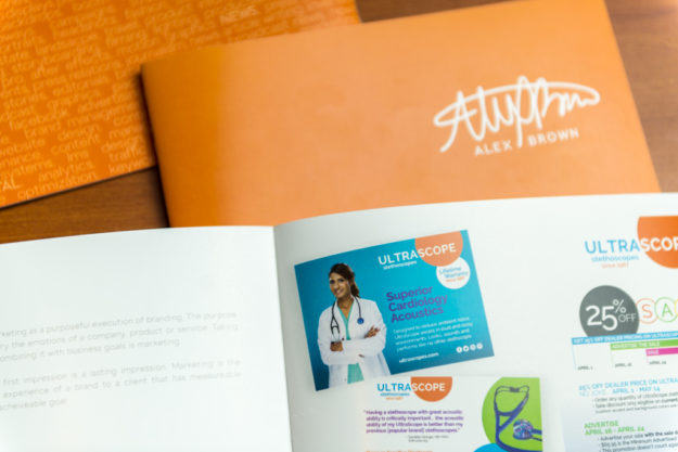
As a versatile designer and visual communicator, I have gained a lot of experience already, and I wanted to showcase my strong suits. The nature of a booklet follows something called the Gestalt theory. This theory suggests that the design as a whole is greater than the sum of its parts.
While there were certain areas of expertise I did not include in this book, the areas in which I highlight are all interlinked, making it nearly impossible to communicate the same message if they were separated.


If you want a copy of a printed booklet, feel free to reach out to me on my about page. I would love to send you one and answer any questions you might have. Plus, it’d be great to get to know you!
To see another awesome creative resume booklet, check out Gerardo Sumano’s on his blog post Creative Resume Handout.
by Alex Brown | Feb 11, 2017
Creating watercolors with Photoshop is fast, easy and fun!
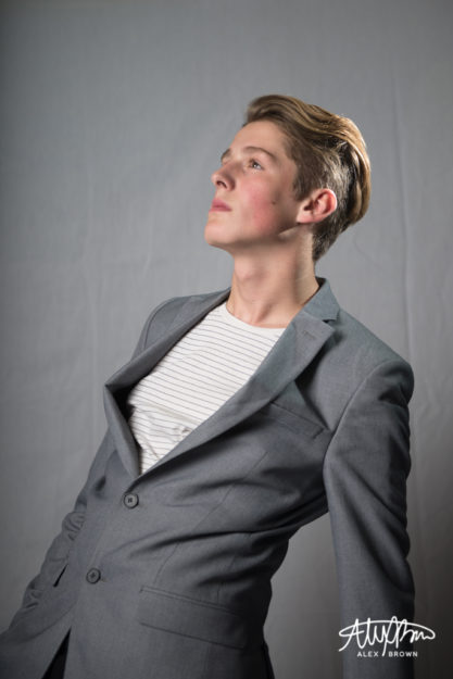
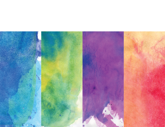
I had a lot of fun creating this watercolor piece in photoshop. I took this picture of Boston, a 15 year old model here in Rexburg, a few months ago at a shoot. When shooting this picture, I wanted to keep it simple. I love his facial expression and how he’s looking off to the left, but also his swagger in his stagger!
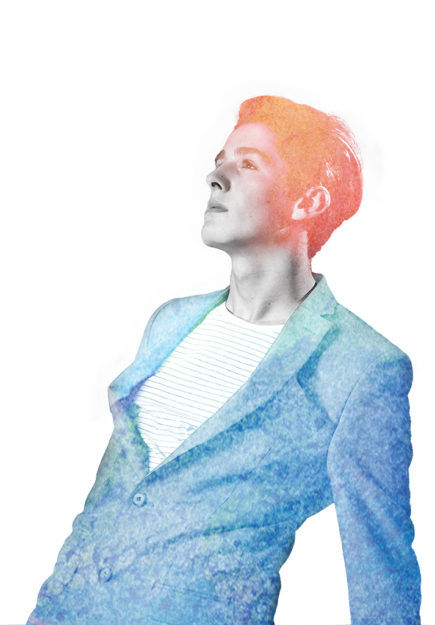
Creating watercolors in photoshop is way easier than I thought it would be. I started by following this tutorial, but eventually dropped off and started exploring on my own!
So you don’t have to watch the video, I’ll do a quick run through of what I did:
- Select and Mask the original photo so it would be against a white background
- Placed the image in a new document
- Desaturated the image 100%
- Added the Watercolor effect from the effect gallery
- Placed the blue watercolor image over my image with the screen blending mode
- Masked out with a brush the blue to only be on his suit
- Placed my orange and pink watercolor image on top with the lighten blending mode
- Masked out with a brush the orange to only be on his hair and then adjusted the opacity to slowly graduate off his face
I chose orange and blue since they are complementary colors and they looked awesome together! When placing the blue watercolor, I included more of the bright aqua tones at the top of his jacket because it was a much more vibrant contrast with the reds, oranges and pinks of the other watercolor in his hair!
Here is the original image of Boston that I used for this watercolor. I used the watercolor textures on a project a few years back so I can’t link to the original download anymore, but heres the file that I still do have and what I used!
by Alex Brown | Feb 11, 2017
Photoshop is awesome when you have a great tagline for an advertisement in mind but no means to make a photoshoot happen!
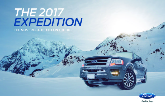
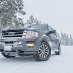
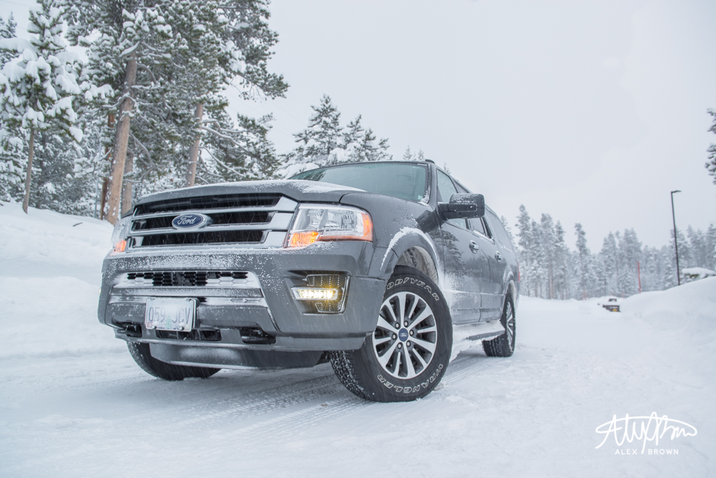
I created this photoshop composite advertising the Ford Expedition. I drove one for a day on a recent photo excursion in Grand Teton National Park. I’m a car guy so I was surprised on how well it drove!
When we stopped to use the restroom, I was just walking around and admiring the car! I decided to take out my camera and tripod and get an awesome shot of this expedition! It was in a natural environment and I thought it looked great.
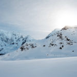
I knew I wanted to create an ad for the Expedition when I had the challenge to create a photoshop composite, so I decided to theme it around the winter months. I love remote mountain scenes, and when you put a skier or snowboarder in it, it makes it even more amazing! I had the story!
After finding the images I wanted, I brought them all together in photoshop where I blended the Expedition into this mountain scene and adjusted the coloring. To add that final touch, I put the snowboarder on the mountain and used the spot healing brush to clear the rocks out of his path (this is realistic, right?).
With the photo done, I then brought it into Illustrator where I added the text following Ford’s current advertising creative direction and dropped in that witty tagline that completes the story told by this composite!

by Alex Brown | Jan 28, 2017
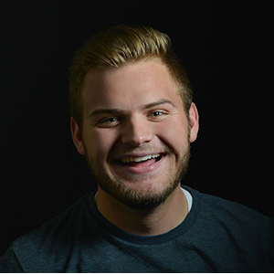
When the avgeek, photographer, and designer in me come together to recreate the movie poster for “Sully”.
Design and photography are essential to movie posters. Both of these being my passions, I needed to think of something else in my life that I absolutely love. And then the ah-ha moment came… AVIATION! Yes, it’s a little weird, not gonna lie. I’m that one crazy person who will connect in Atlanta in order to fly on an international aircraft instead of flying nonstop. Now, it was trying to find the right movie to depict.
Recently, Sully, the movie came out. I still haven’t seen it, but I remember that night exactly. It was a January night when a flock of geese took out both engines of US Airways flight 1549. After 208 seconds after taking off from New York’s LaGuardia airport, Captain Sully Sullenberger made the decision to ditch his Airbus A320 aircraft, along with 155 people on board, into the freezing waters of the Hudson. I remember this night very well. We were on our way home after going to Costco. We had just gotten back on Independence Blvd. in Charlotte and my dad turned up the radio. I wasn’t exactly sure what happened, so the minute I got home, I turned on the TV and watched the coverage from there.
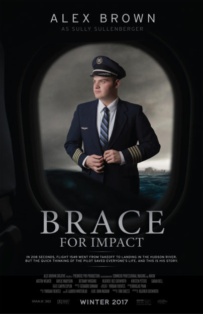
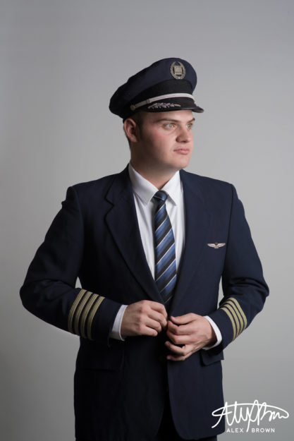
Being an Avgeek, making an aviation movie poster meant that it not only had to be realistic but most importantly it had to be accurate. Everything except for the tie and white shirt is apart of a real US Airways uniform that I acquired a few years back from a pilot friend. The uniform wasn’t the same one worn by crews at the time of the crash, however, it still is real!
Editing the Movie Poster
When it came to editing my poster, I wanted to keep it as realistic to the actual Sully movie poster itself as well as to the
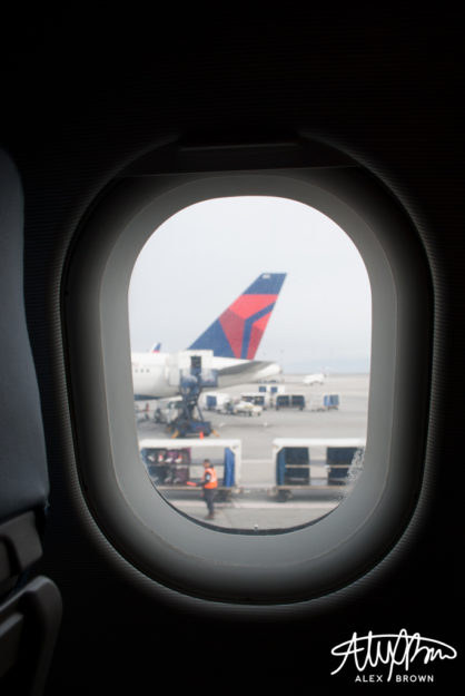
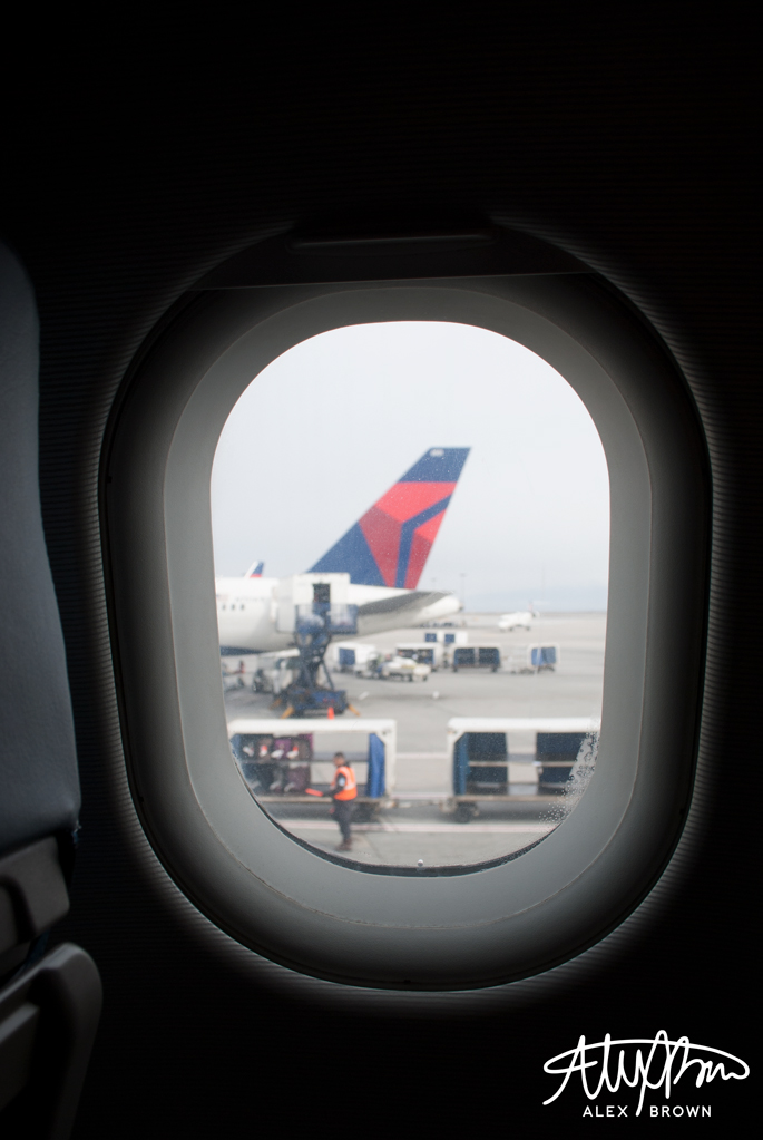
I decided to use my own picture of an airplane window I took a few years ago instead of using one from the internet. With the water and clouds, I used images from the Sully Movie website and reconstructed the layers in Photoshop. After doing some simple retouching, I removed the background on my self-portrait and placed it in my poster.
The wings were too difficult to get a hold of, so I was able to find a high-quality picture of them from StanWings.com, an aviation wings website, and photoshopped them on the jacket. The hardest thing about this part was the fact that the new uniforms from US Airways all had silver badges and accents, instead of the gold that are on mine, so I also spent a lot of time photoshopping the wings to make them match the hat.
After finishing my photo, I then went into Illustrator, where I put together the text of the poster. I chose to rename the movie “Brace for Impact” because first off I’m not Sully, but second off it was the words heard from the cockpit before the plane went down.
Here are the direct links to images used from the internet: http://www.sully-movie.com/img/plax-bkg/desk-land_plax_0.png, http://www.sully-movie.com/img/plax-bkg/desk-land_plax_3.png, http://www.sully-movie.com/img/plax-bkg/desk-land_plax_1.png, http://www.sully-movie.com/img/plax-bkg/desk-land_plax_clouds.jpg, http://www.stanwing.com/wings/u/usair/USAir_28-Supervisory%20Captain%20Wing%208th%20Issue.jpg


