by Alex Brown | Feb 25, 2018
How good real estate photography can turn showings into a sold sign.
The thing I love most about Real Estate and architectural photography is the fact that it serves as a silent salesperson. After working in real estate marketing for a little over the last five years, I’ve grown to see the importance that real estate photography has when selling a house. My motto is that good real estate photography gets showings and showings get offers!
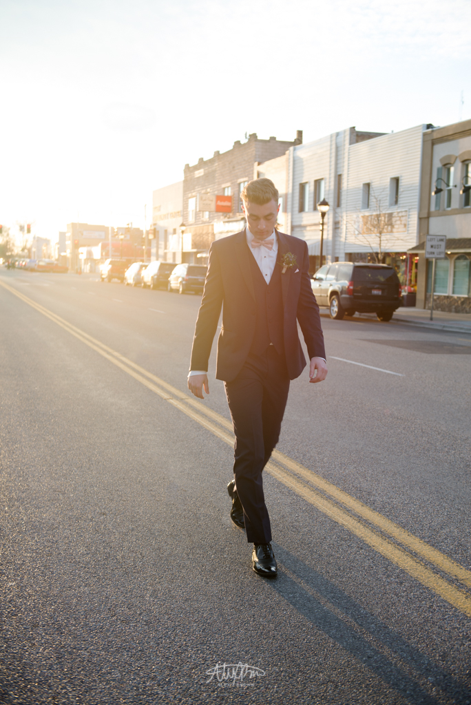
3029 Marblebrook was a great example of how good real estate photography transformed a house with little showings to a sold sign out front. Before, the real estate photography was dark and didn’t showcase the to photographing this property, the real estate photography was dark and didn’t showcase the tons of natural light that the house had. Furthermore, it made the spaces look smaller and the open-concept floorplan enclosed and less open.
Here are three different photos taken of 3029 Marblebrook by another real estate photographer in the area:


The Result After: A bright, open concept floorplan filled with natural light featuring it’s transitional and contemporary design. After being called in by the agent, I wanted to showcase the natural light that flooded this home, the tall ceilings on the main floor and the beautiful hardwood floors that flowed throughout the main level.


To see more tips on how you can go about hiring a real estate photographer, check out this article on Placester. If you are looking for a Salt Lake Real Estate Photographer, contact me today and your first listing is free!
by Alex Brown | Jan 20, 2018
Turn your smartphone camera snapshots into beautiful fine art photographs
Over the Martin Luther King, Jr. holiday break, I took a trip through Island Park, Idaho on my way to northwestern Wyoming. I have driven through Island Park numerous times, but never before in the winter. The snow covered pine trees were beautiful against the gradient blue to white sky, and I knew I had to capture a picture of this!
I prefer to take any picture with my DSLR, however, in this case it was in the back seat and just barely out of reach to grab it and still get the shot in time. So, I went to my pocket and pulled out my smartphone camera on the iPhone X! After a few clicks of the shutter, I ended up with some shots.

Let me be completely honest… these smartphone photos are absolutely terrible! You probably are thinking to yourself “I could have gotten a better shot than this professional!”
Am I embarrassed about this photo I captured with my smartphone camera? Absolutely not! People typically underestimate how powerful a smartphone camera can be for fine art photography. All we have to do is extract the image’s potential!
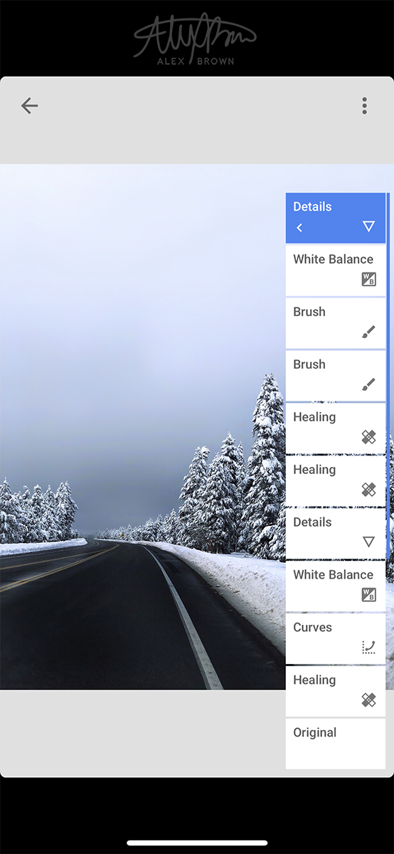
The middle man: Edit your smartphone photography with Snapseed!
I should preface this section by saying that I am in no way sponsored by Snapseed at all, but am totally up to it! Snapped is an amazing photo editing app that you can use to edit your smartphone photos. Before I found Snapseed, I totally believed that you could never get an amazing photo out of your smartphone camera. In order to get a photo from your smartphone that rivals one from your DSLR, it has to be edited! Here’s a quick screenshot to show you the individual steps I did to edit this smartphone photograph. While the number of steps may look overwhelming at first, treat it just as if you were editing a regular photo in photoshop. If you’re an everyday shooter, I’d recommend using the presets in the curves edits for maximum results.

The Final Product: A Beautiful Winter Fine Art Photography Scene

After finishing my editing, the final product is a beautiful winter fine art photography shot, this take taken by smartphone. No matter what smartphone you have or what skill level you shoot at, anyone can become a smartphone photographer! For more tips on how to master smartphone photography check out this great guide by DigitalGuide.
by Alex Brown | Mar 30, 2017
How spreading out my creative versatility and skillset in a booklet turned my resume into a creative resume. How it all comes together.
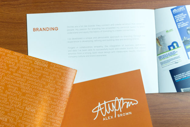
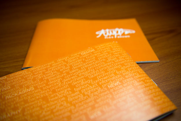
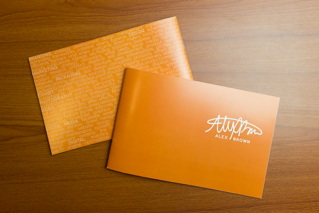
I wanted my creative resume to be different enough, yet still be mainstream. I love booklets. I think they scream professional and they are so fun to work with especially because of the spread design.
My original creative resume plan wasn’t able to come to production because of unforeseen changes in what has been going on lately. The very essence of my original creative resume plan was a booklet that tied into something that you can eat. It was witty and original.
I went ahead and continued with doing a booklet for my creative resume. I wanted the size to feel more custom, more unique, so I made it an 8.5×5.5 landscape. Using a landscape design allowed me to make the design breathe, allow for more white space and increase readability.
The design is very simple and minimalistic with bold design elements and placement.
When designing a booklet, flow is critical to the overall experience. I arranged the content and spreads in the book that parallels my process and design cycle.
As a versatile designer and visual communicator, I have gained a lot of experience already, and I wanted to showcase my strong suits. The nature of a booklet follows something called the Gestalt theory. This theory suggests that the design as a whole is greater than the sum of its parts.
While there were certain areas of expertise I did not include in this book, the areas in which I highlight are all interlinked, making it nearly impossible to communicate the same message if they were separated.


If you want a copy of a printed booklet, feel free to reach out to me on my about page. I would love to send you one and answer any questions you might have. Plus, it’d be great to get to know you!
To see another awesome creative resume booklet, check out Gerardo Sumano’s on his blog post Creative Resume Handout.
by Alex Brown | Mar 22, 2017
The importance of brand attitude in high end fashion photography
We all have our own personalities. Some of us may be quirky, some of us may be more mainstream. When it comes to a brand, it has a personality too. But what exactly is a brand personality? Millward Brown describes a brand personality as “the way a brand expresses and represents itself.”
People don’t react to brands as people, but do, it appears, react to brands in a consistent, measurable way, call it the Brand Five. -Whit.li
The Brand Five that Whit.li has developed includes sincerity, excitement, competence, sophistication, and ruggedness. This brand five are some of the most common examples of how consumers perceive a brand’s personality.
When a new brand is being created, or a brand is being redefined, brand personality traits are the basis and guiding direction of the brand. Anything communicated, whether it be to the consumer or an employee, should identify and correlate with the defined brand personality.
It’s our job to make sure that all of our communications are consistent with the following brand personality traits. Our brand personality traits describe how we want our customers to perceive our company define a brand from the beginning. – Walmart Brand Guidelines
How can something intangible, like brand personality, be manifested through branding? One way is through photography.
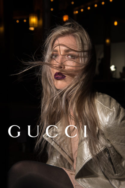
When it comes to luxury fashion brands, Gucci is one of the most prominent and popular brands.
2015 was a major year for Gucci as it completely switched it’s creative direction, under the direction of Alessandro Michele.
Fashionista.com has described the new creative direction as having a “mysterious vibe that that leads consumers to wonder about the story behind them.”
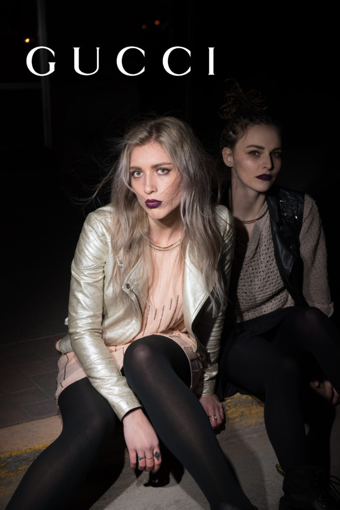
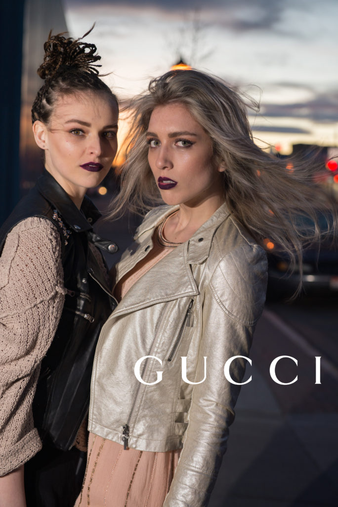
The 2015 ad campaign featured a prominent use of wind, symbolic of the change of creative direction.
All of these photographs are in homage to the 2015 Gucci campaign. They feature the current brand placement of the logo with the creative direction of the 2015 campaign.


To see more high end fashion campaigns visit this website.
by Alex Brown | Mar 22, 2017
How adding two simple things can take a women’s fashion photoshoot to the next level.
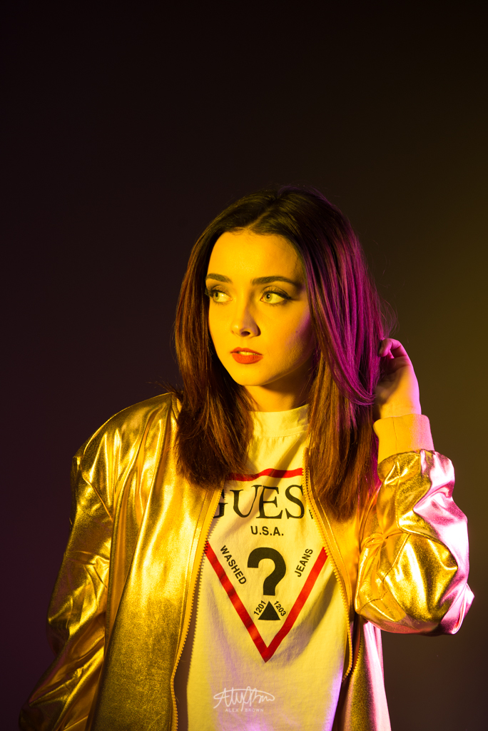
This post is one in a series in what I like to call Fashion Focus. I love color. Always will. Whenever I can incorporate color into a photoshoot, I jump all over the opportunity. Recently I bought a 47″ octobox light modifier for my speedlights. It’s been a great purchase and I absolutely love it! However, I wanted to see fi there was a way to create a color gel for the modifier itself. And sure enough, there is.
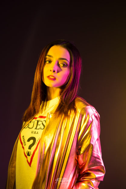
Go to your local Michael’s or craft store and find rolls of colored cellophane. Buy whatever color you like and at your next fashion photoshoot, tape it over the octobox, as if it were your soft box cover. On this shoot we had pink cellophane covering the octobox on the right, with a strobe light and a yellow filter to her left.
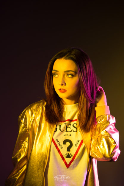
When working with color, the hardest thing to master is what I call color spill. In this photo, my model Noelle turned enough just so that the pink gel only lit her hair.
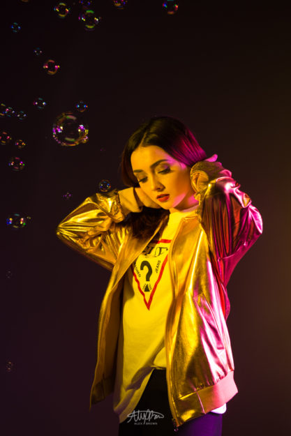
Another cool thing that you can do to make shooting with color even cooler is use bubbles! In order to get a lot of bubbles, consider buying a bubble machine on Amazon or at your local store.
Take a look at Nordstrom’s 2017 Spring Campaign, the inspiration behind this shoot.
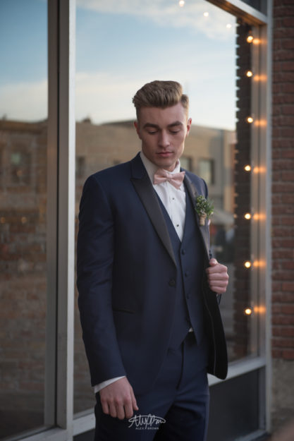
by Alex Brown | Mar 22, 2017
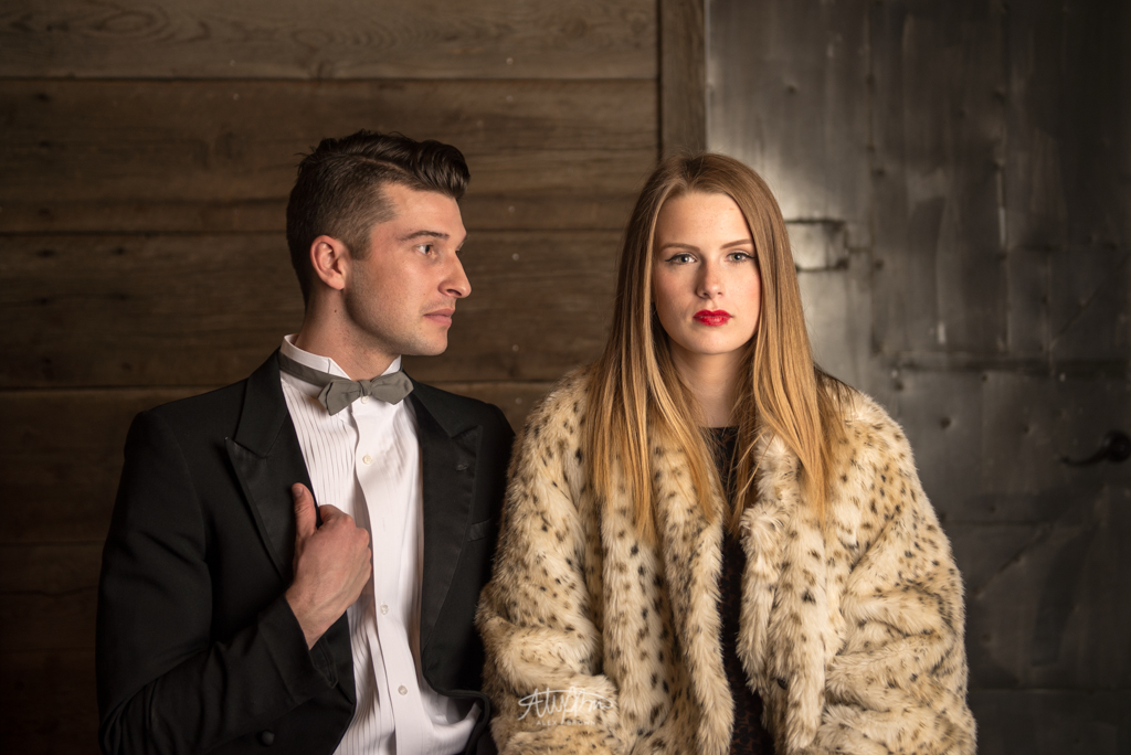
Why good chemistry is important between models for fashion photography.
This post is one in a series in what I like to call Fashion Focus. With fashion photography, there’s a very slim chance that your models you need will have real chemistry between them. As a photographer, we make photographs come to life, create interest in interactions, and emulate emotion. When shooting a scene that involves two people in an intimate setting or relationship, you have to make it believable.

Take a look at this photograph. This fashion photoshoot was inspired by the 1920s, also known as the roaring 20s. While I did direct my models, Ana and Josh, to pose this way, you can still notice how there isn’t any chemistry or a spark of connection between the two.
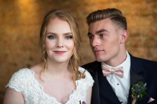
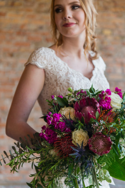
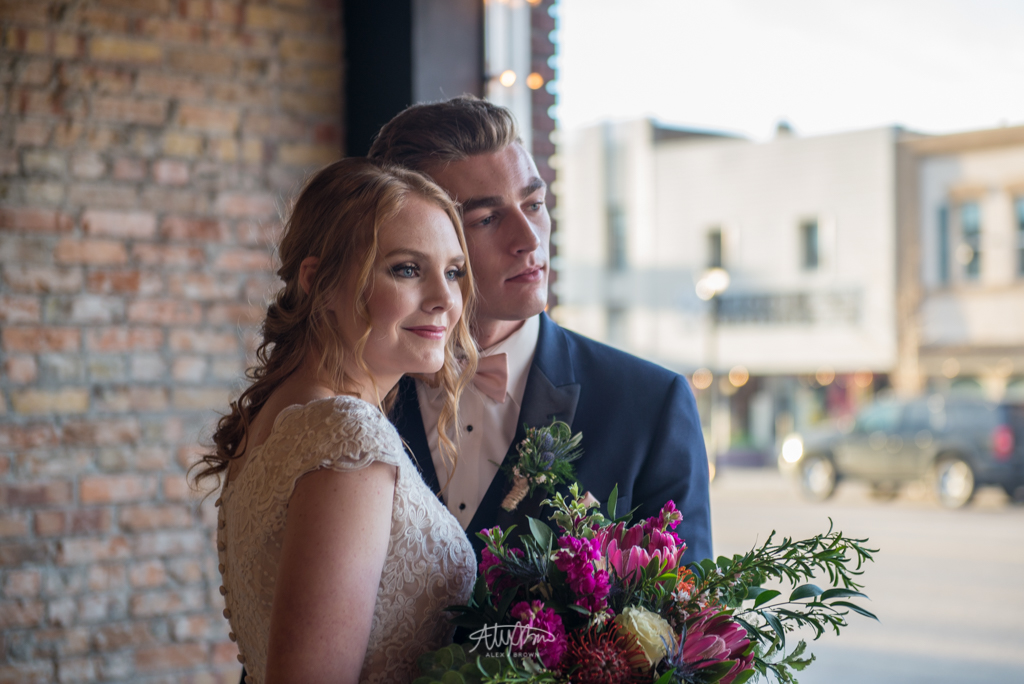
Compare the photo of Josh and Ana to this one of Brianna and Josh Miller. Isn’t this just already better?! When shooting couples or groups for fashion photography, it’s vital that you create the connection and chemistry between the models. I think the reason why the chemistry is more believable is because of how relaxed both of the models are. I love how Josh is leaning into Brianna and he has that love smize going on.
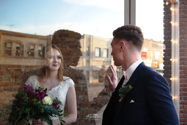
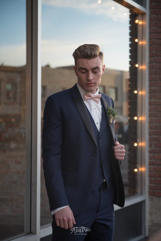
Here’s some more pictures of Josh and Brianna.


Take a look at some of the sample images from Lindsay Adler’s course on how to photograph couples.


